A modern, cohesive evolution of the Mubadala brand — one that honours its legacy while positioning it confidently for a digital-first future.
Our Role
- Identity, visual language & guidelines
- 2D/3D Animation
Modernizing the brand
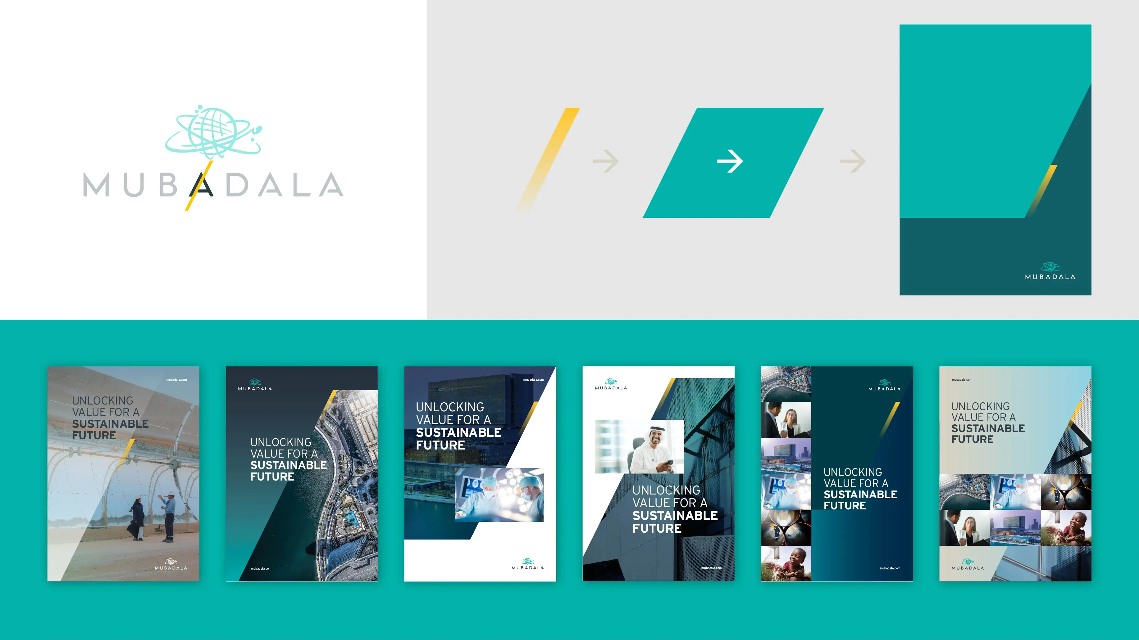
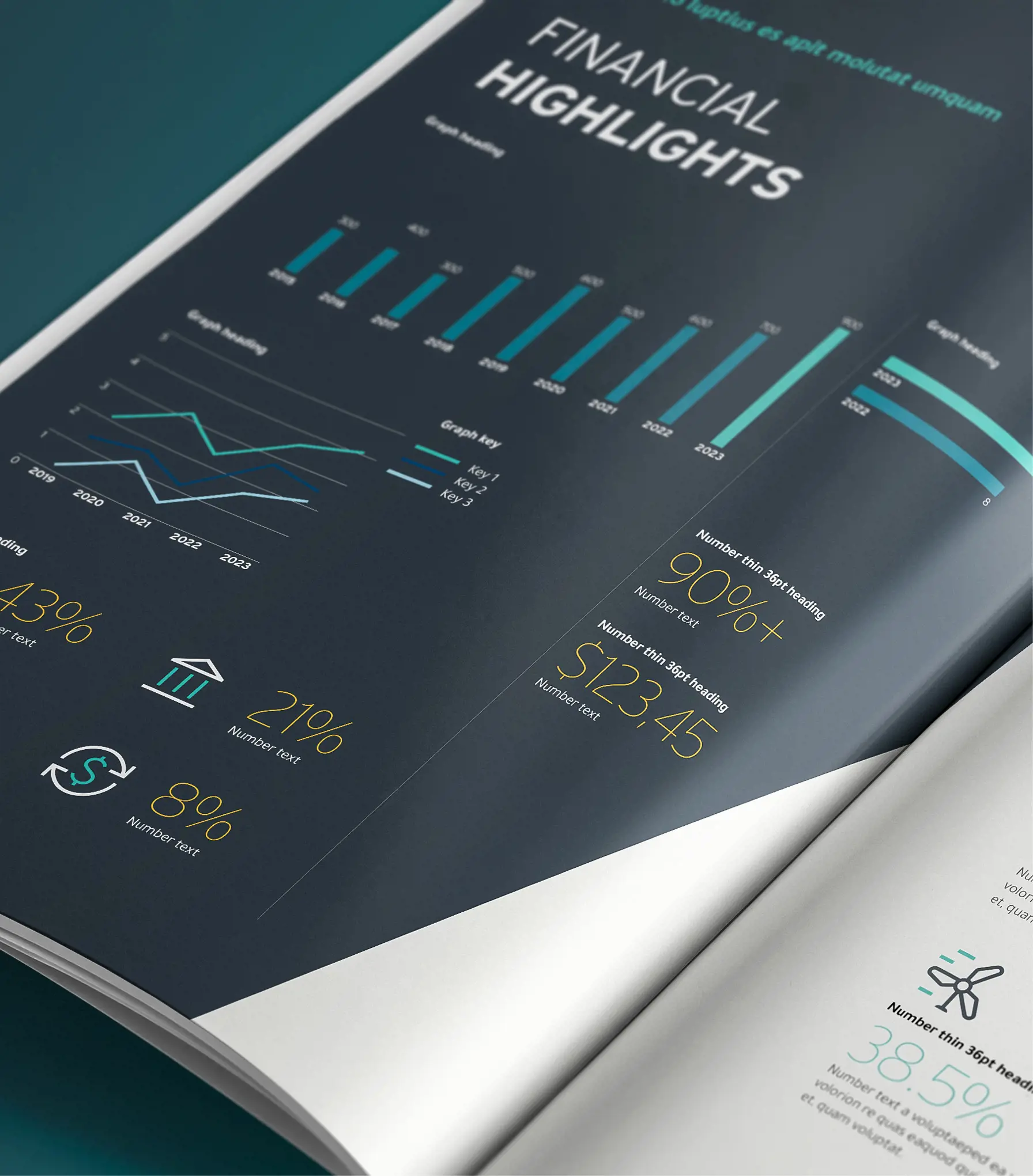
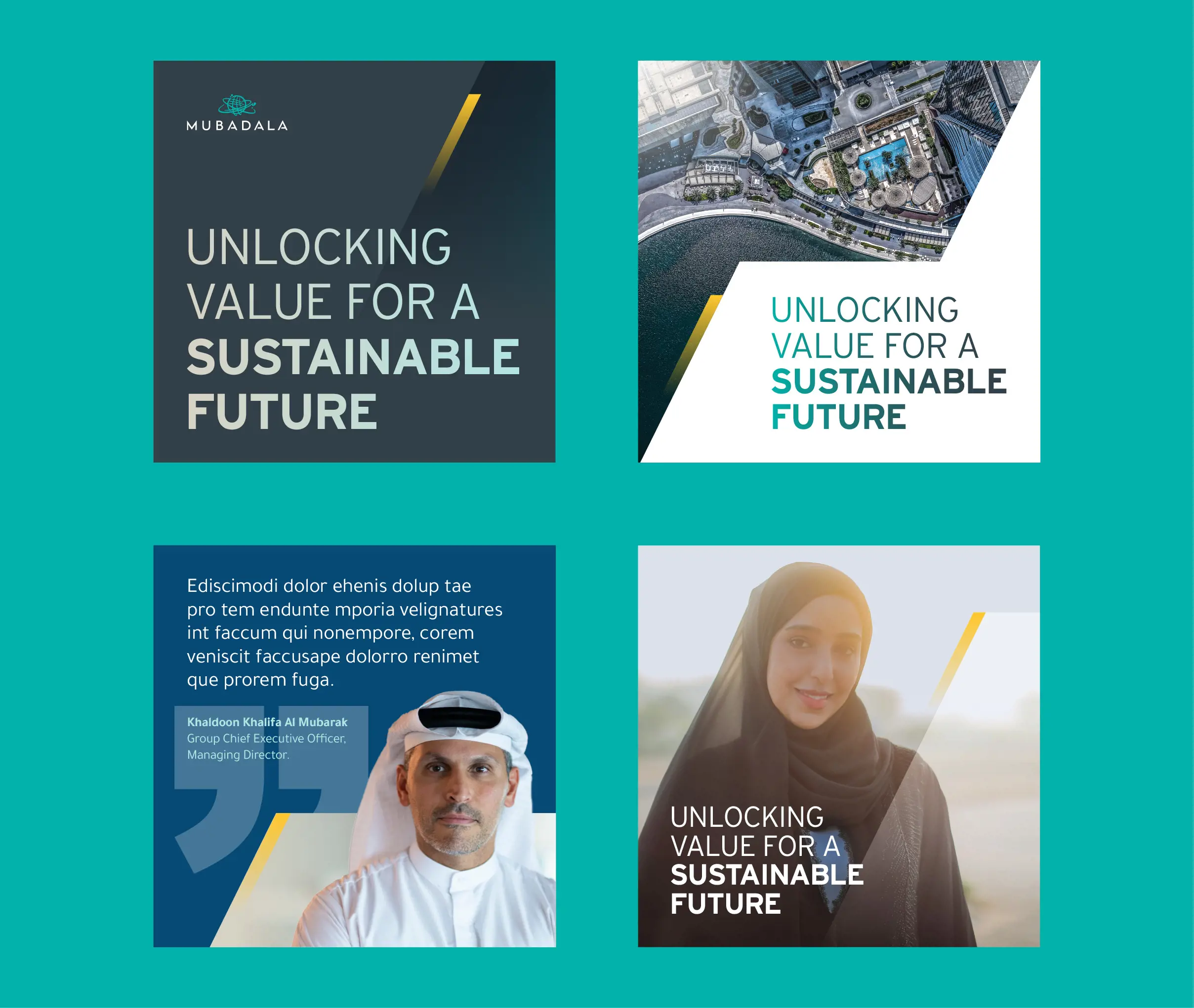
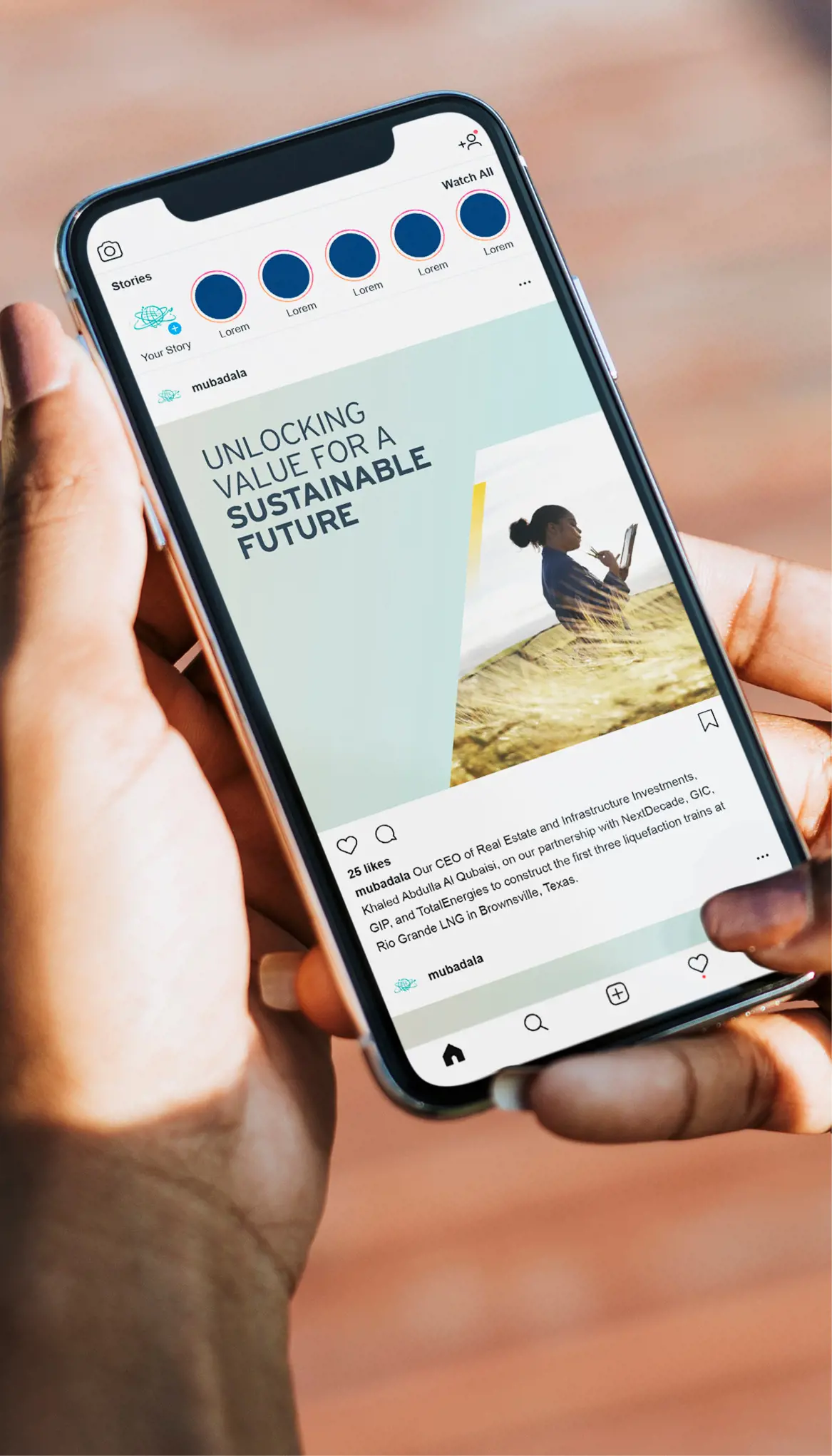
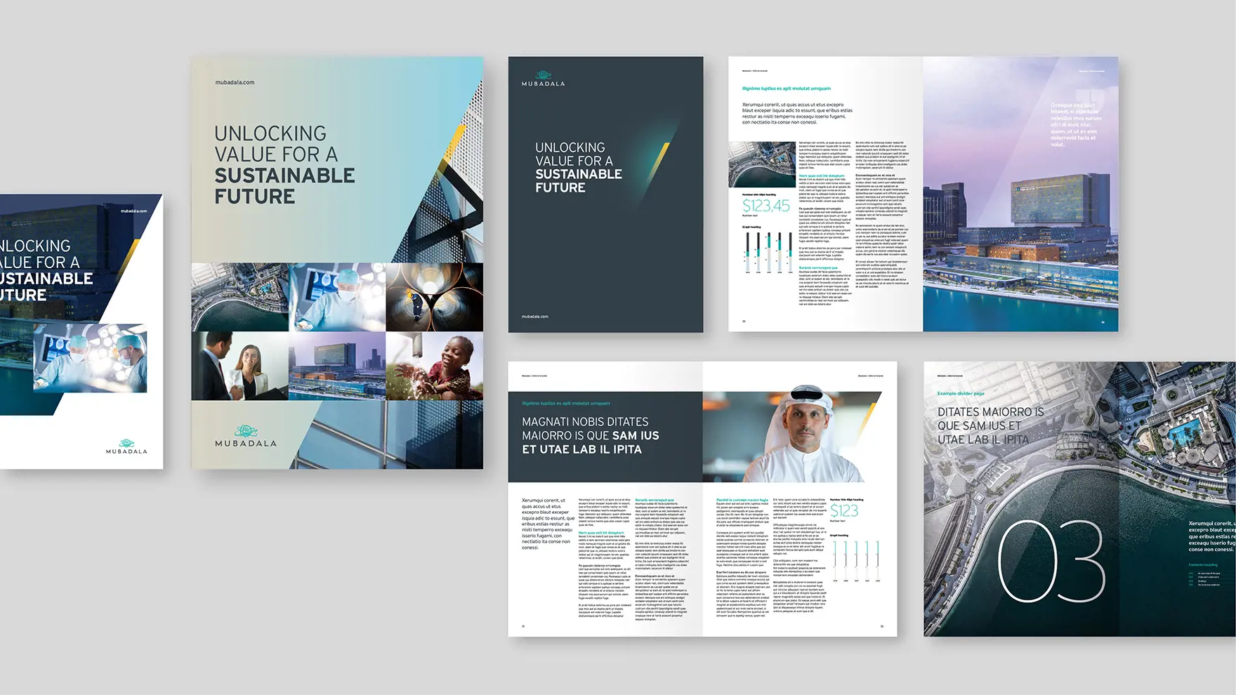
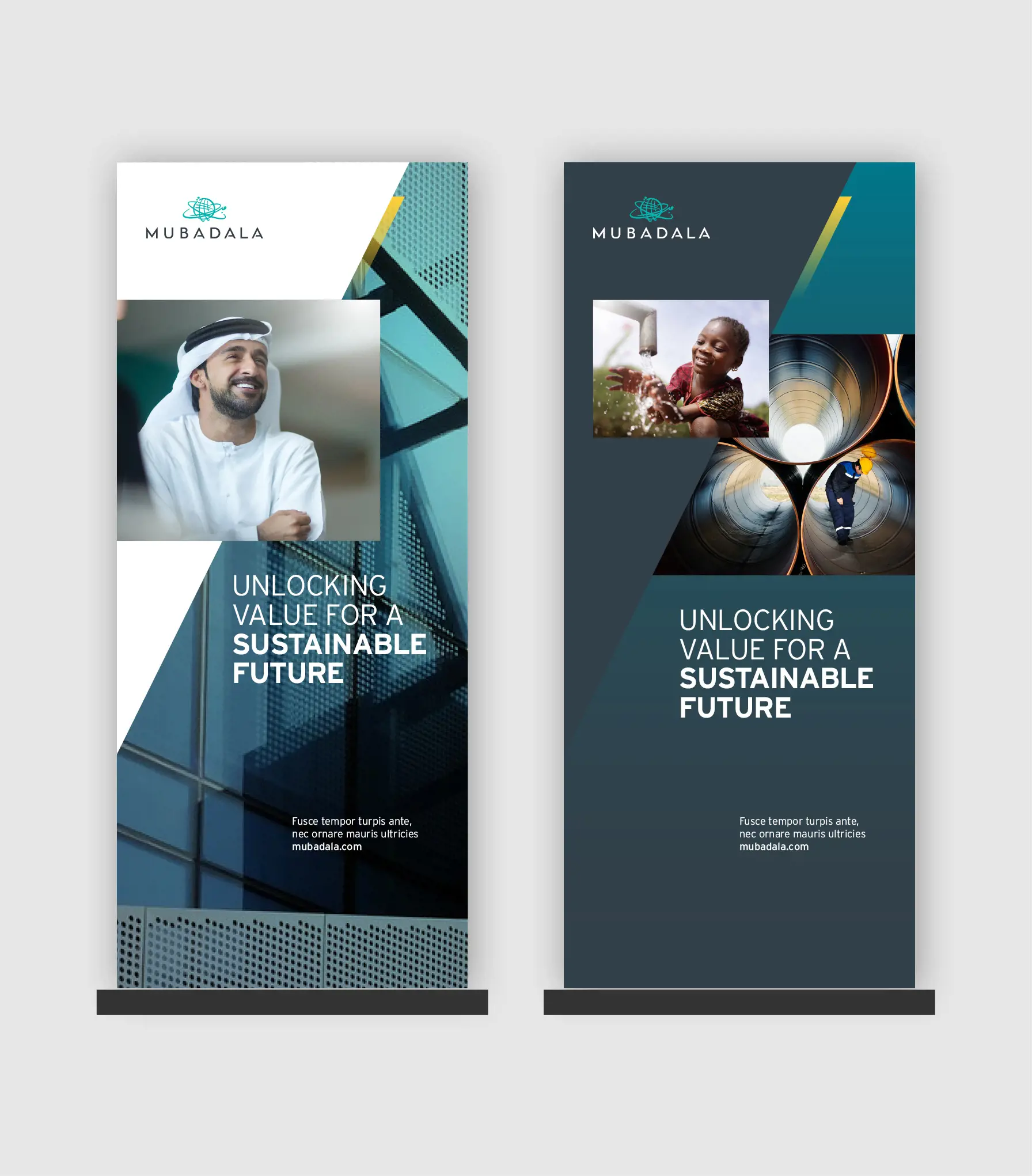
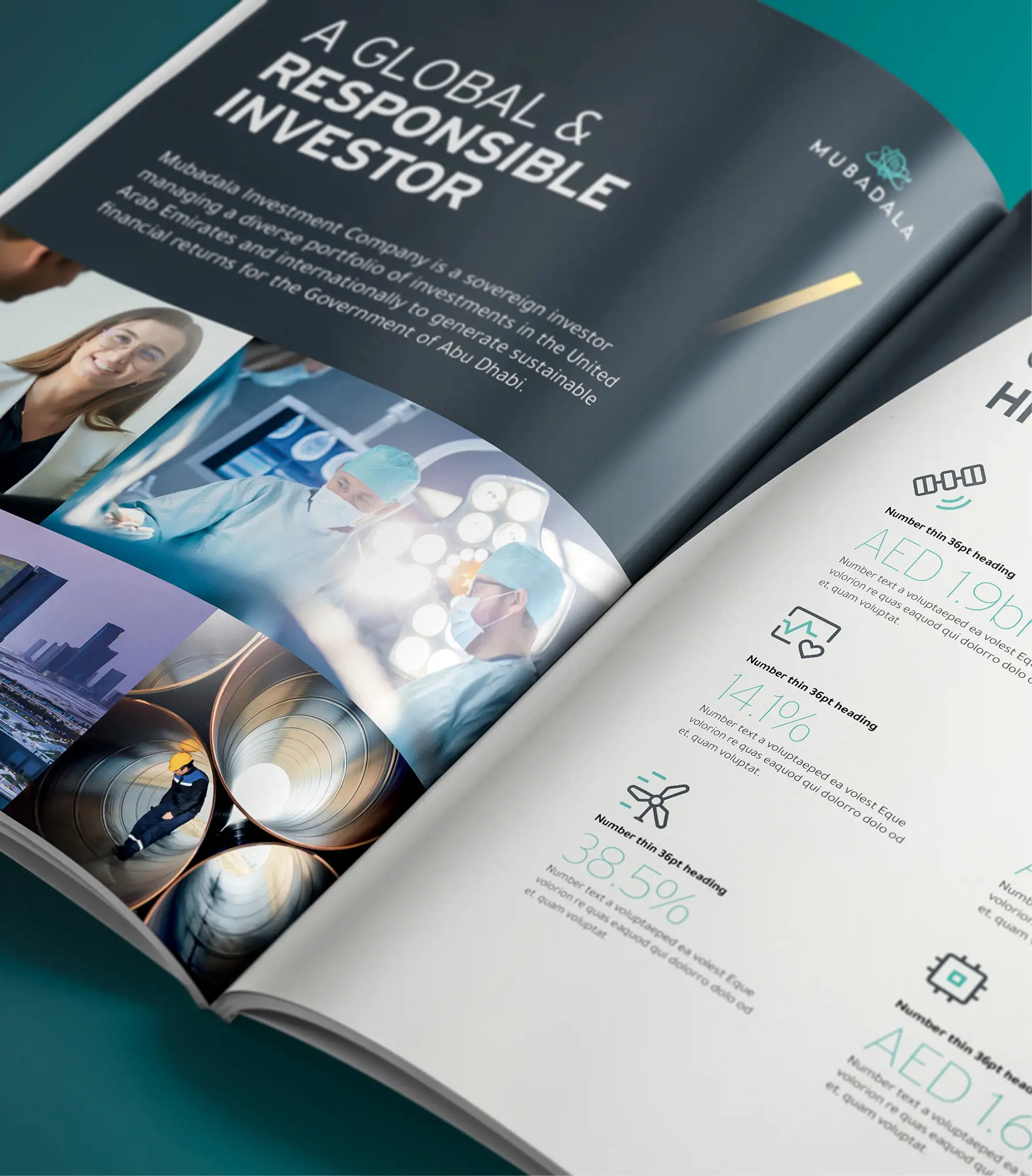
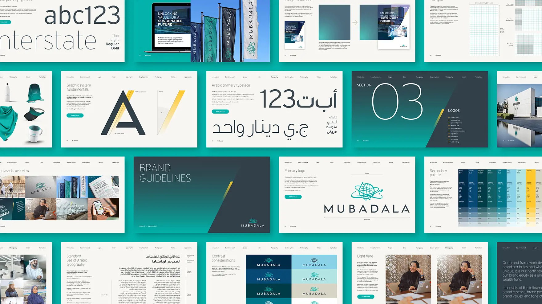
In a rapidly evolving digital landscape, Mubadala recognized the need to modernize its brand system to stay relevant and globally resonant. We were engaged to deliver a refined, future-ready visual identity that maintained brand equity while addressing key usability challenges. This included an outdated photography style, a limited and subdued colour palette, and corporate fonts that lacked legibility across digital applications and platforms such as social media and sponsorship environments.
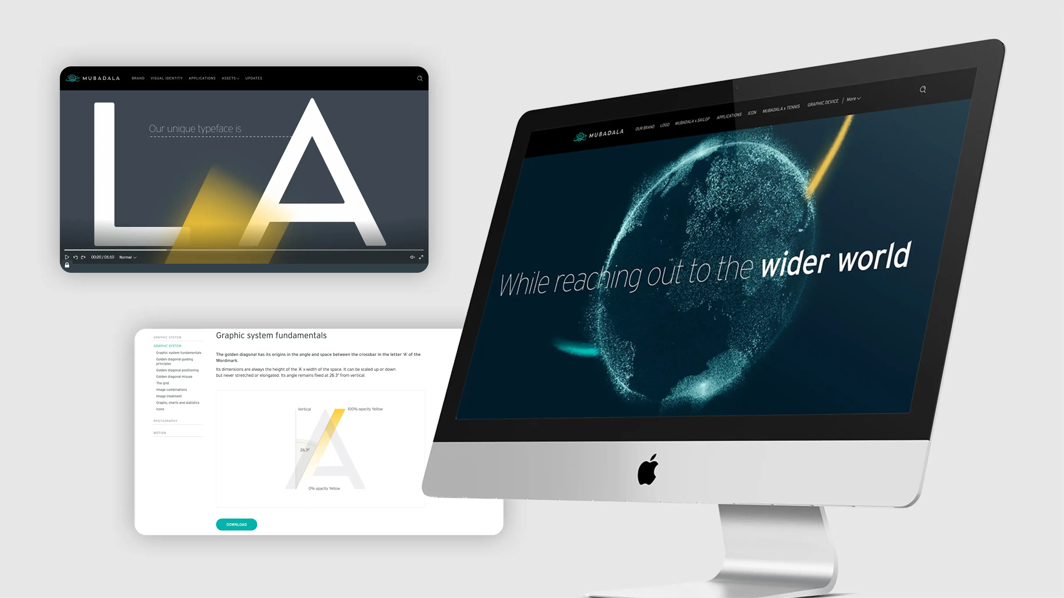
The Golden Diagonal
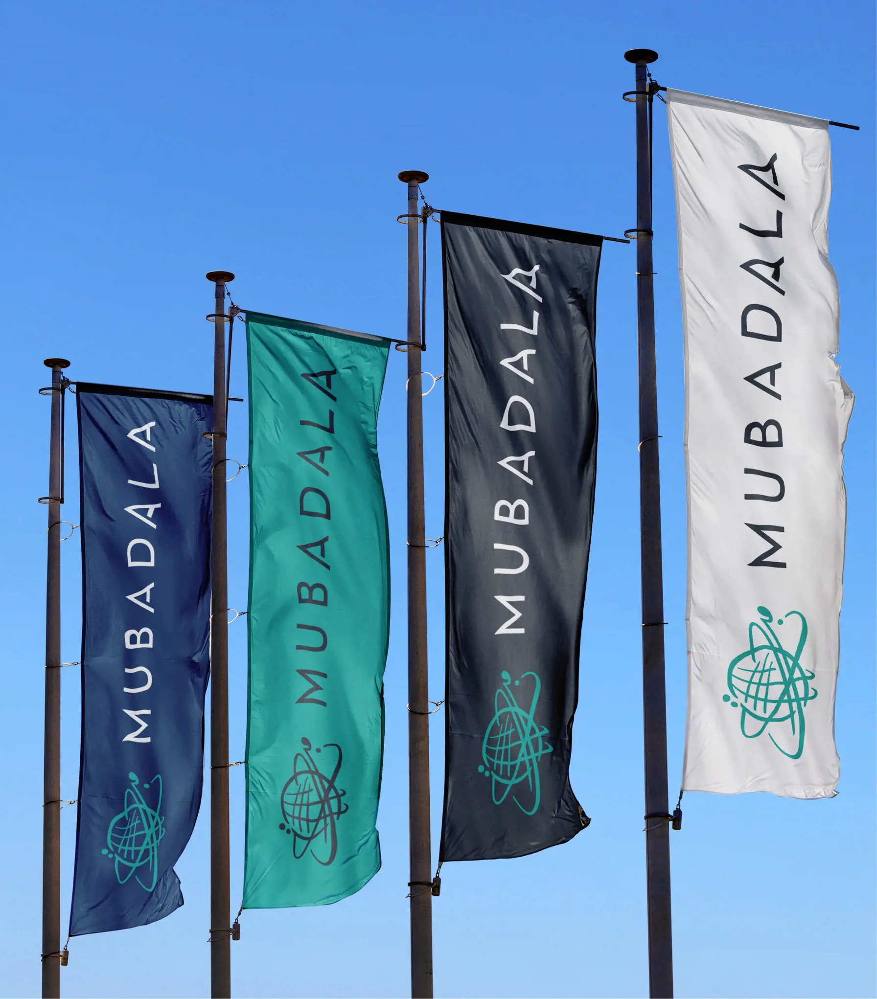
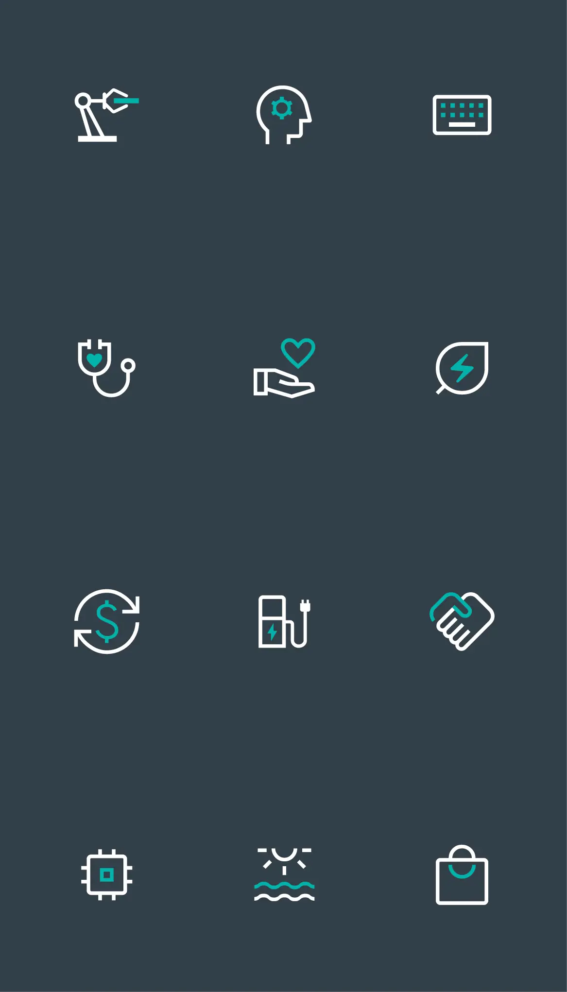
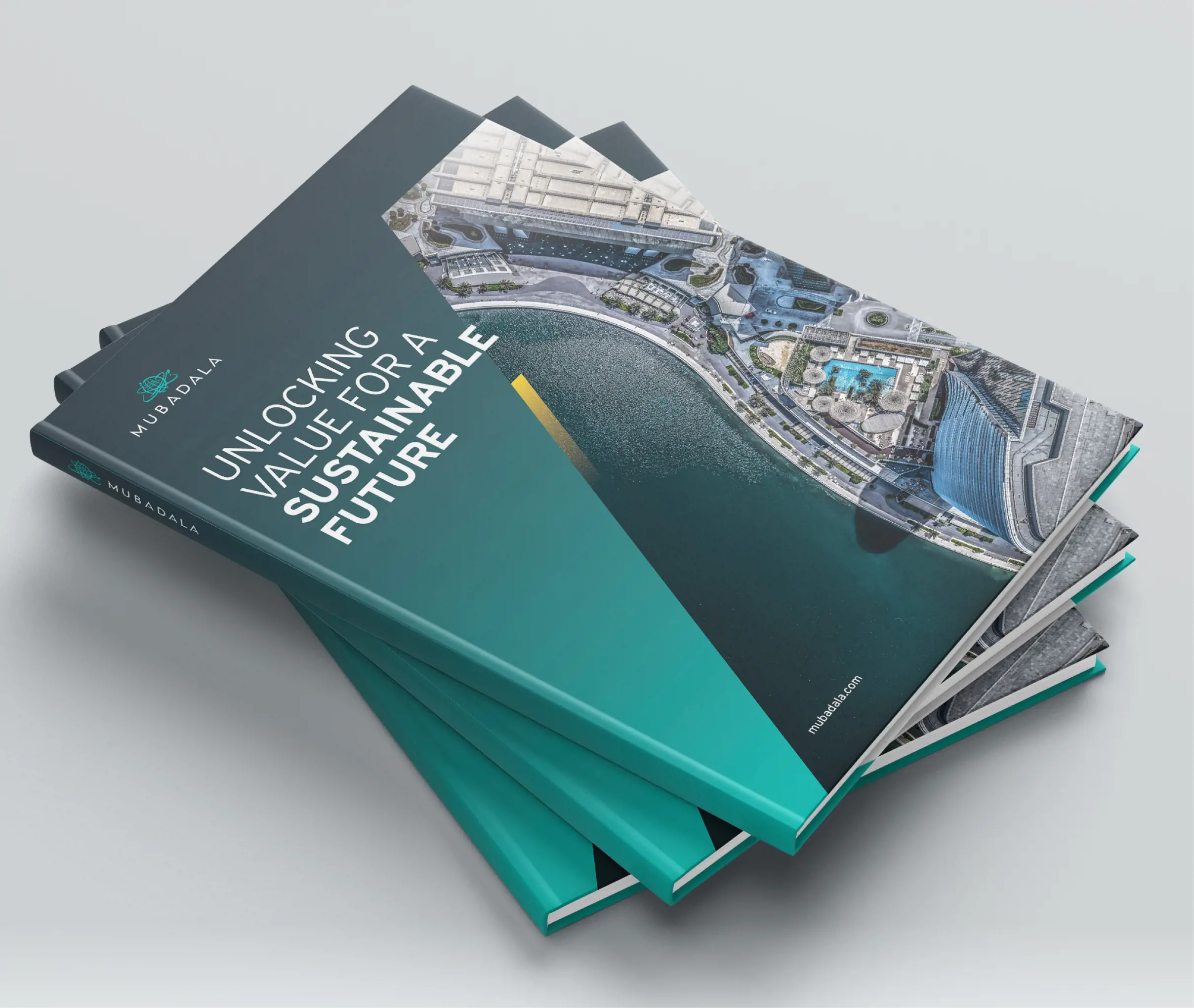
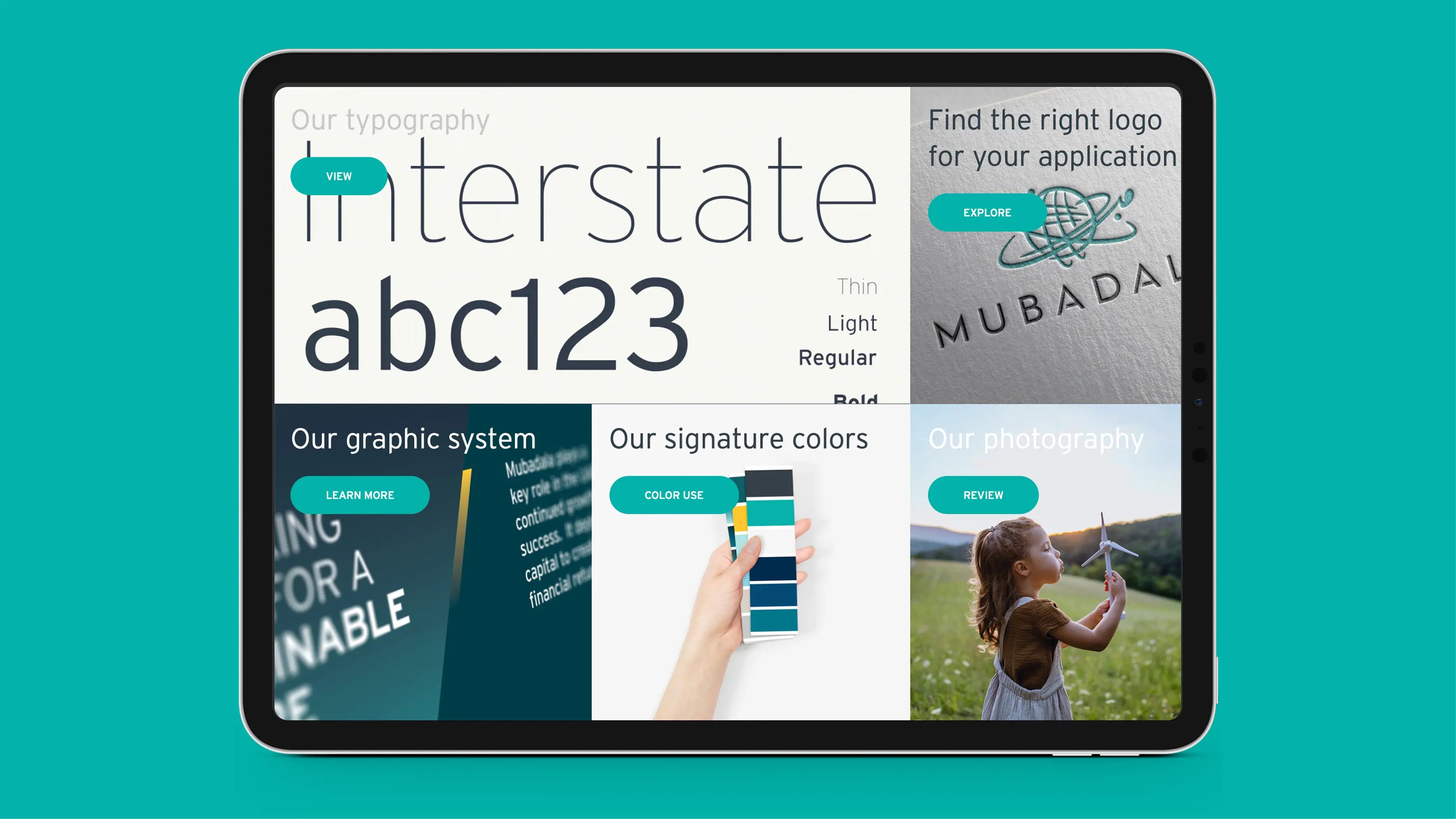
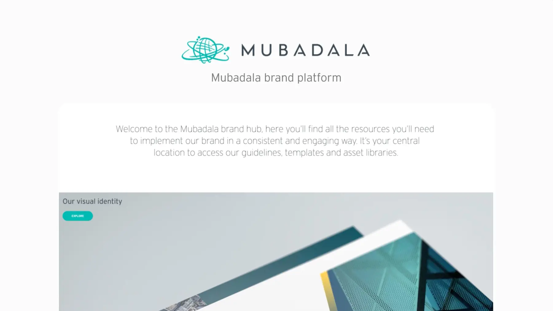
At the core of the visual refresh is a distinctive diagonal motif — inspired by the negative space in the ‘A’ of the Mubadala wordmark — representing ambition, momentum, and growth. We expanded the brand’s colour system with rich new tones and gradients, introduced a contemporary secondary typeface for both English and Arabic, and redefined the photography direction across four categories: People, Sectors, Metaphor, and Detail. All elements were consolidated into a new online brand portal built on Frontify, enabling intuitive access and consistent brand implementation across the organisation.
